Curriculum 'User Guide Viedoc 4'
Forms Download PDF
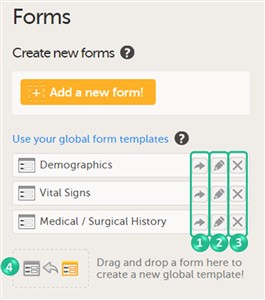
1 Overview of the forms page
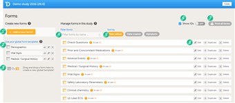
- On the forms page in Viedoc Designer, you can create, edit and manage forms.
- The forms page gives you the following options (see image): 1. Create a new form from scratch. 2. Create a new form by using a form from the global templates. 3. Add a form to the global templates. 4. Filter and search forms. 5. Sort forms by the date they are edited, the date they are created or by name. 6. Display the form IDs. 7. Print forms (with or without IDs). 8. Edit, duplicate or delete a form.
2 About the lay-out and content of a form
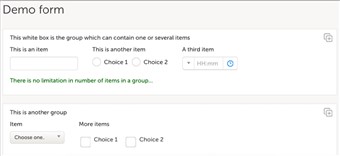
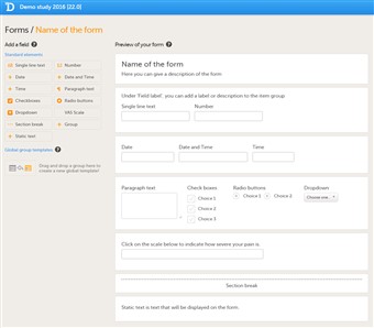
- A form consists of one or several item groups that contain one or several items (variables/texts).
- A white box in the form defines a group of items. An item group can have a header.
- A yellow box highlights an item. The yellow box is displayed when hovering over the item with the mouse.
- You can adjust the settings of an item group and the settings of single items.
- To access the item group settings, click within the white box that forms the group, outside an item.
- To access the item settings, click the area (yellow box) of an item.
3 Item types
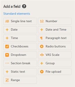
- A form can contain different types of items:
Item type Used for Single line text Capturing free text Number Capturing numeric data Date Capturing a date Date and time Capturing a date and time Time Capturing a time Paragraph text Capturing larger texts Checkboxes Multiple choice questions that allow multiple answers Radio buttons Multiple choice questions that allow only one answer Dropdown Multiple choice questions that allow only one answer, the options are displayed in a dropdown menu that allows the selection of a single option from a list VAS scale Displaying a scale with slider (in ViedocMe) and a numeric field (in Viedoc Clinic) for monitoring of pain or the intensity of symptoms Section break A divider on the page Group Adding an item group to the form Static text Displaying text (information) on the form File upload Uploading a file to the form Range Entering a range of values.
4 Create a new form
- To create a new form from scratch, follow the steps below:
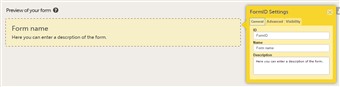
1. Click Add a new form. The form window and Form Settings pop-up open. 2. In the Form Settings pop-up, on the General tab, enter the ID and the name of the form. A description is optional. 3. On the Advanced tab, select 1) whether functions with dependencies on items in other forms shall be updated automatically when the other forms are saved (see detailed description in Auto update functions section below), and 2) whether you would like the form to be a hidden form that is not visible in Viedoc Clinic.(This option is only available when the auto-update option is activated). 4. On the Visibility tab, select 1) whether the form shall be visible for all roles or only for a selection of roles, and 2) whether the data in the form shall be editable by all roles (that can view the form) or only by a selection of roles. If you select selected roles, select which roles should be able to view the form and to edit the data. 5. Click Save changes to save the form. - You can now fill the form with item groups and items, see below.
5 Auto update functions
- Under the Advanced tab it is possible to enable the Auto update functions (functions are executed when dependencies change) option.
When this option is checked, the form will be updated automatically when it contains items with a function that depends on items from other forms. When the value of one or more of the dependency items is changed (either in Viedoc Clinic, ViedocMe or via the API), the function is re-executed, and the form is automatically updated as follows:- the item is updated with the new value that resulted from re-executing the function
- the visibility conditions are validated
- the edit checks are validated
- the form status is updated
- For example, let’s consider a form (Form A) with the auto update functions option enabled, and an item in form A (Calculated_Item) with a function (F) dependent on cross form items Input_Item_1 and Input_Item_2 from form B.
When Form B is saved (in Viedoc Clinic, ViedocMe, or via API), function F is re-executed. If, as a result, Calculated_Item has a changed value, then Form A is updated by:- Updating the value of Calculated_Item to the new one
- Re-validating visibility conditions
- Re-validating the edit checks
- Updating the form status (such as missing fields)
- A form with the auto update functions option enabled, that is monitor locked, is still being updated by re-executing the functions. When a value changes the form is saved and the review and the signature are broken, the form still being monitor locked.
- Form history
When a form is auto updated due to dependency changes (see description above), the reason for change displayed in the form history is Automatically updated due to dependency change. - Revisions
When enabling the auto update functions option in a new revision of the design, and the Hidden form option is not checked, the form will be marked as changed and the functions will be executed during the upgrade. - A form with the auto update functions option enabled can be set to be a Hidden form. Hidden forms are automatically initiated when the event is initiated in either Viedoc Clinic, ViedocMe or via the API, but are not visible.
Hidden forms are not included in any status/statistics/metrics count.
Hidden forms are not included in the PDF archive.
Hidden forms (or data in hidden forms) are not signed.
Hidden forms are automatically reset when the respective event is reset.
Hidden forms are included in the export.
Revisions- When you disable the Hidden form option in a revision, for a form with auto-update functions option enabled, the form is automatically upgraded and made visible.
- When you enable the Hidden form option in a revision, for a form with auto-update functions option enabled:
- Manual/bulk upgrade is required for the existing (visible) forms. After the investigator confirms this, the form becomes hidden.
- Hidden forms are initiated when applying the revision for the initiated events.
6 Global templates
- In addition to creating a new form from scratch, it is also possible to create a form using a global template.
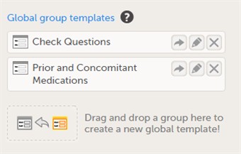
- To create a form using a global template, click the arrow icon beside a global template (nr 1 in the image) to open the global template. You can now edit and save the form. Any changes to the form will not affect the global template.
- You can edit a global template by clicking the edit (pen) icon beside the global template (nr 2 in the image). The global template will open and you can edit the template. This will not affect the original form that has been used as the basis of the template.
- You can delete a global template by clicking the delete (X) icon beside the global template (nr 3 in the image). A pop-up window will appear. Click Delete to confirm deleting the global template, or click Cancel to cancel.
- You can create a global template from one of the forms that are used in the design by dragging and dropping the form to the field Drag and drop a form here to create a new global template! (nr 4 in the image). The form will appear in the list of global templates, and can be used or edited as described earlier. All item settings made in the form will be preserved when the form is added to the global templates.
- The global templates are visible in all studies within your organization, and for all users within your organization that have access to Designer.
7 Add items to a form
- To add an item to the form: 1. Click one of the standard elements in the left pane of the form window. or 2. Drag and drop an element to an existing item group.
- If you click one of the standard elements, the item will appear in the selected group. If no group is selected, the item will appear in a new group on the form.
- You can move the items within the group or between groups by dragging and dropping the items.
- Click Save changes to save any changes to the form.
8 Configure an item
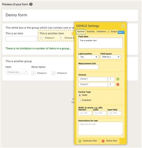
- You can configure an item in the item settings pop-up.
- Click the item to open the item settings pop-up.
The item settings pop-up has five different tabs:
See below for more information about the General, Visibility, Validation and Function tabs.Tab Settings to adjust General Set the appearance of the item. Visibility Set the visibility conditions of the item. Note! Making an item hidden to certain role(s) leads to the respective clinic role(s) not being able to see the form PDF. The PDF remains invisible to that role even after removing the hidden item from the form in a new revision. This, since the PDF includes a full audit trail of all items ever existing in the form revisions, even a hidden item due to role visibility that was removed. Validation Set the ID of the item and add data checks that validate the item. Function (f) Set functions that calculate the item, or set default values. Output Set the Output field ID (OID) and Output Field Label. This is useful in case you would like the item to have another ID or label in the export than the ID that is used within Viedoc. abc Click abc to open a menu in which you can control font style (normal, bold, italic, underline, superscript or subscript), font colour (black, grey, red, green) and font size (small, normal, large, huge). Mark the text and click the respective icon - Note! For ODM compliance, keep the length of the Output Field ID, as defined on the Output tab, to a maximum of 8 characters.
9 Item Settings - General
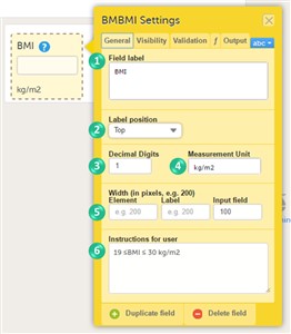
- On the General tab, you can adjust the appearance of the item.
- You can adjust the following settings (see image): 1. Field label: a label that describes the item 2. Label position: the position of the label relative to the input field. The default, and recommended, position is 'top' (above the label). 3. Decimal digits: For numeric items only, the number of allowed decimals. 4. Measurement unit: a measurement unit for the item. The measurement unit will be displayed below the input field. 5. Width of: • Element: the size of the outer element box (whole item) in pixels. • Label: the size of the field label in pixels. • Input field: the size of the input field in pixels. 6. Instructions for user: free text, for example a more detailed description of the item. When text is entered here, an i (info) icon will be displayed beside the field label. Hovering over this icon with the mouse will display the text.
- The field label will be used as the item label when exporting data, unless an Output Field ID or Output Field Label is defined on the Output tab.
10 Item Settings - Visibility
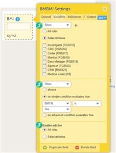
- On the Visibility tab, you can adjust the visibility conditions of the item.
- You can set the following conditions (see image):
1. Which roles can view the item?
Select Show or Hide, and select:
• All roles, to show or hide the item to/from all roles.
• Selected roles, to show or hide the item to/from a selection of roles. Select the roles to/from which the item should be shown or hidden.
2. When is the item shown?
Select Show or Hide and select when the item should be shown or hidden:
• always.
• based on a simple condition: dependency on only one item on the same form, see below.
• based on an advanced condition: dependencies on other forms or visits, see below.
Note! An item set as hide always will be populated with data as a result of function execution only if it is present in an non-hidden item group. An item group is hidden either if all the items in the group are hidden or if the item group is hidden.
3. Who can edit the item? Select Enable edit for: • All roles, so that any role that can view the item also can edit the item. • Selected roles, so that only selected roles can edit the item. Select the roles that shall be able to edit the item. - To select or hide an item based on a simple condition that is dependent on only one item on the same form, follow the steps below:
1. Select on simple condition evaluates true. 2. Select the item on which the visibility condition should be based. 3. Select whether this item should be equal to (is) or not equal to (is not) a certain value, for the condition to be true. 4. Enter the value on which the visibility condition should be based. - To select or hide an item based on an advanced condition, which allows multiple dependencies, follow the steps below:
1. Select on advanced condition evaluates true. 2. Use JavaScript to define the condition. For more information about JavaScript, see the eLearning lesson Using JavaScript in Viedoc. - Note! Do not use Hide to all roles! If an item is hidden to all roles, the data stored in the item will be cleared upon saving the form. If you wish to store values in a field that should be hidden for all users, select Hide and always as described under nr 2.
11 Item Settings - Validation
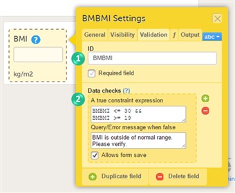
- On the Validation tab, you can set the ID of the item and add data checks that validate the data entered into the input field.
- You can change the item ID (nr 1 in the image). The item ID is the ID that will be used to identify the item in the database.
- Note! The item ID should not be changed from one study design version to the next in a production study. If you change the ID of an item, data checks, role visibility conditions and other features that identify the item based on the item ID will stop working. If you need to change an ID after the study is set to production, change its Output Field ID under the output tab.
- You can enter data checks (nr 2 in the image). To enter data checks, follow the steps below:
1. Click the + icon. 2. In the field A true constraint expression, enter the condition on which you would like the data entered in the input field to be accepted, without triggering a query or error message. Use JavaScript to define the condition. For more information about JavaScript, see the eLearning lesson Using JavaScript in Viedoc. 3. In the field Query/Error message when false, enter the error message that should be displayed when data are entered that are not fulfilling the conditions defined in step 1. 4. By default, the form can be saved even if data are entered that are triggering a query or error message. If you would like to disable form save, clear the check box Allows form save. - You can enter multiple data checks for the same item.
- To remove a data check, click the - icon.
- For the Date and Date and Time items, there is a system check available that allows you to prevent entering future dates when filling in the form in Viedoc Clinic. There are two options to prevent dates after:
- Event date
- Current clinic date
12 Item Settings - Function
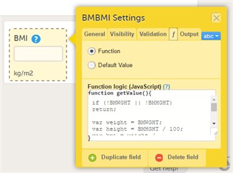
- On the Function tab, you can set functions that calculate the item, or set a default value that will be displayed as a default in the input field.
- If you define a function, then the field will become read-only for the site user. As an example, BMI (as shown in the image) will automatically be calculated from the height (BMHGHT) and weight (BMWGHT) entered by the user. This value will be shown in the BMI field, and will not be editable by the user.
- In contrast to a function, a default value will be displayed in the field the first time the form is opened and the item becomes visible, but the value will still be editable for the site user.
- To set a function, select Function. In the field Function logic (JavaScript), enter the function using JavaScript. For more information about expressions that can be used, click the ? icon. A pop-up will open that displays information on how to refer to items from other forms, items from specific visits or activities, context variables and check boxes.
- To set a default value, select Default value. In the field Default Value or JavaScript expression, enter the value you would like to set as default, or enter a JavaScript expression.
- For more information about JavaScript, see the eLearning section Using JavaScript in Viedoc .
13 About the VAS scale
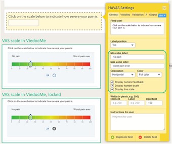
- The VAS scale (visual analog scale) can be used to measure a characteristic that ranges across a continuum of values, for example a patient's level of pain or the intensity of certain symptoms. By default, the scale runs from 0 to 100.
- When used for forms in Viedoc Clinic, the VAS scale will appear as a numeric field, into which a number between 0 and 100 can be filled in.
- When used for questionnaires in ViedocMe, the VAS scale will look like a scale with a slider, see image. By clicking on the scale or by moving the slider, a patient can indicate how severe the pain or symptoms are. Clicking on the reset button will remove the slider and clear the numeric value. The slider will reappear when the user clicks on the scale. Once the ViedocMe questionnaire has been submitted, the slider is disabled and the reset button is replaced by a lock.
- In addition to the item settings as described above, you can adjust the following settings of the VAS scale (see image):
- Min value label: Enter a label that is displayed at the minimum value of the VAS scale.
- Max value label: Enter a label that is displayed at the maximum value of the VAS scale.
- Orientation: Select the orientation of the scale: horizontal or vertical.
- Color: Select whether the scale should be displayed in full colour or gray-scale.
- Display numeric feedback: Display a number below the scale that indicates the position of the slider.
- Display number scale: Display a numeric scale.
- Display line scale: Display tick marks on the scale.
- Display Min/Max value labels top/bottom (vertical scale)*: option to display the min and max values on the top, respective bottom of the vertical scale. This option is available only for the vertical orientation.
- Display label above numeric feedback (vertical scale)*: option to configure a label that will be displayed above the numeric feedback. This option is valid only for the vertical orientation and if the Display numeric feedback option was checked.
* These settings should be used when you are using the VAS for the EQ5D questionnaire.
- If you want to ensure that the VAS scale is be displayed at 10 cm, we recommend the use of an iPad Mini for filling out ViedocMe questionnaires.
14 About the File upload
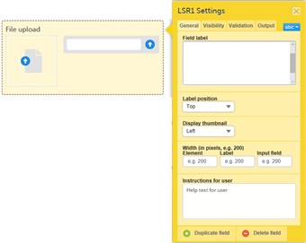
- Under General tab, from the Display thumbnail dropdown list, set if you want a thumbnail to be displayed and choose the position for it:
• Left: the thumbnail will be displayed on the left side.
• Below: the thumbnail will be displayed below the file upload field.
• None: no thumbnail will be displayed.
Note! The thumbnail is supported only for the jpeg, gif and png files. If you choose to show a thumbnail for other file types, then it will show only the file extension.
Note! Using thumbnails will increase the amount of stored data. - The maximum allowed file size is 512 MB.
- The total amount of data used by a study can be monitored in Viedoc Admin, on the studies overview page as well as on the specific study summary page.
- For safety reasons, it is not allowed to upload executable files. The complete list of unsupported file types can be found in the Release Notes Viedoc 4.34.
- Under the Validation tab, you can enter data checks that validate the data entered into the input field, as described in section 10. Item Settings - Validation above.
The properties available for the file upload item are:
ItemID.FileName- the name of the uploaded file. ItemID.FileSize- the size of the uploaded file in bytes. ItemID.FileHash- the MD5 hash of the uploaded file. - The uploaded files will be included in the export output.
15 About the Range item
- The Range item is used whenever there is a need for defining a range of values, such as in a Lab results form for the normal range of values for a specific measurement.
When filling in the form in Viedoc Clinic, it is possible to define the range of values by choosing one of the following options:- “-“ – Inclusive in between.
- “<” – Less than.
- “≤” – Less than or equal to.
- “>” – Greater than.
- “≥” – Greater than or equal to.
- “=” – Equal.
- Under the Validation tab, you can enter data checks that validate the data entered into the input field, as described in section 10. Item Settings - Validation above.
- The properties available for the range object are:
RangeObject*.Lower- the lower limit of the range - number. RangeObject*.LowerFormat- the number of decimals used for the lower limit of the range - number. RangeObject*.Upper- the upper limit of the range - number. RangeObject*.UpperFormat- the number of decimals used for the upper limit of the range - number. RangeObject*.Comparator- the comparator used to define the range. The available comparators are:
•InclusiveInBetween- defines a range beween a lower and an upper defined limits. •LessThan•LessThanOrEqualTo•GreaterThan•GreaterThanOrEqualTo•EqualTo
Note! When using the comparator in functions, make sure to write it between quotes, e.g."LessThan". It is case sensitive, so make sure to type it in exactly as stated above.- string. RangeObject*.StringValue- the string representation of the respective range item - string.
*RangeObject can be obtained as output of the first two functions described below. - The functions available to be used in conjunction with the range item are described at Using JavaScript in Viedoc.
16 Duplicate and delete items
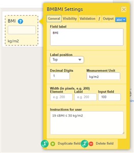
- To duplicate an item, click the item and click Duplicate field in the item settings pop-up (nr 1 in the image).
- To delete an item, click the item and click Delete field in the item settings pop-up (nr 2 in the image).
17 Global item group templates
- Similar to forms, you can also create item groups using global item group templates. Global group templates are available on the Forms page.
- To create a global group template, drag and drop an item group to the field Drag and drop a group here to create a new global template!.
- To add a global item group template to your form, click the arrow icon beside a global template. You can now edit the item group. Any changes to the item group will not affect the global item group template.
- To delete a global item group template, click the delete (X) icon beside the global template. A pop-up window will appear. Click Delete to confirm deleting the global template, or click Cancel to cancel.
18 Preview a form
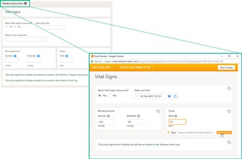
- To view and test a form, click Preview of your form. All changes to the form must be saved before they can be viewed in the preview mode.
- A preview of your form will open, displaying the form as it will look in Viedoc Clinic. You can test the items, and possible functions, data checks, dependencies and visibility settings (that depend on items within the same form) by filling in some values. Visibility settings that depend on items in other forms or visits cannot be tested in the preview mode.
- If the form is translated to other languages, it is possible to also view the translated versions of the form in the preview mode.
- Close the preview mode by clicking the close button.